2015 was an exciting year for Twitter at the Clinical Congress of the American College of Surgeons. The #ACSCC15 selfie contest catapulted off the #ILookLikeASurgeon movement with vigor. The contest drew in a plethora of Twitter neophytes who posted their first tweets at the Congress, leaping into #SurgTweeting.
According to Twitter data analytics from Symplur, #ACSCC15 had record Twitter participation with over 50 million impressions, 14,000 tweets and over 2,500 participants. Statistics, however, only tell part of the story; they do not reveal the interactions and interconnections of those who tweeted. In other words, they reveal little about the network. To illustrate these connections, Twitter data can be organized graphically into interactive network visualizations.
Using Twitter’s API, I (Mookie Thayer, of @PresentServices) built interactive data visualizations for #ACSCC14 and #ACSCC15. These visualizations were created using the mentions, favorites and retweets of all tweets that included the conference hashtags. The #ACSCC14 network visualization of mentions and retweets can be viewed below.
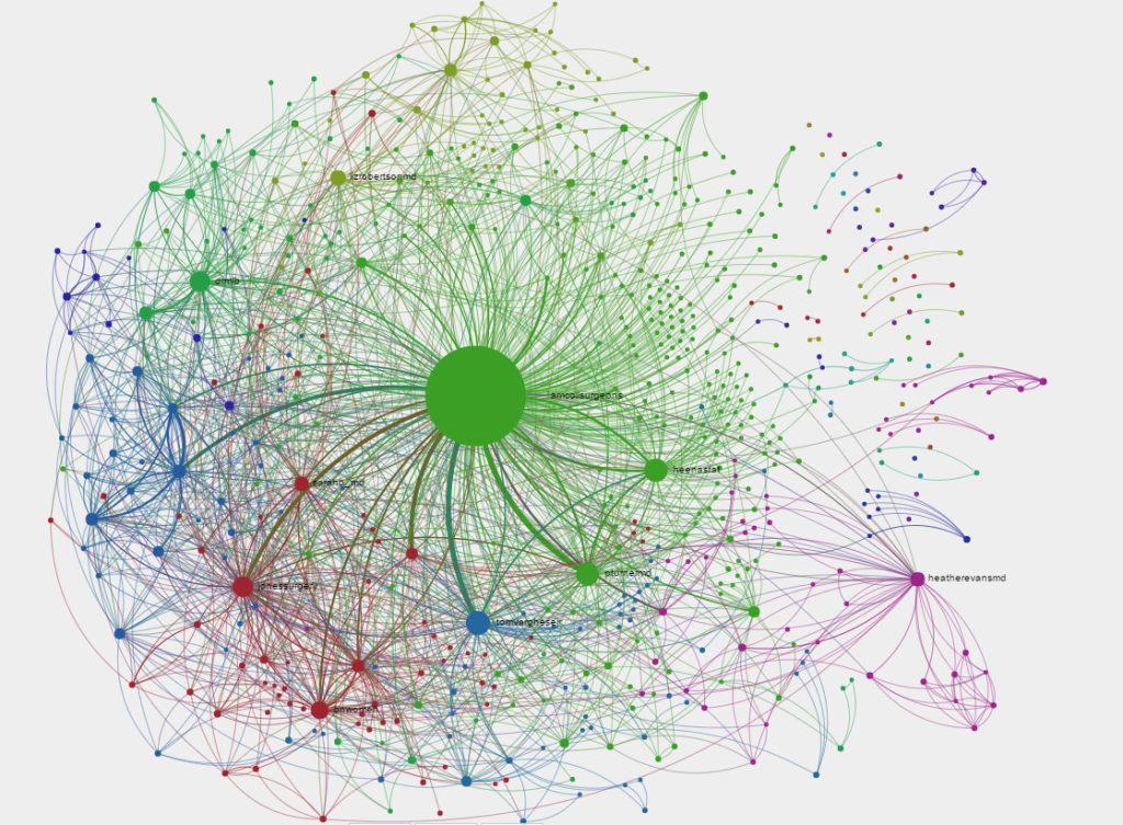
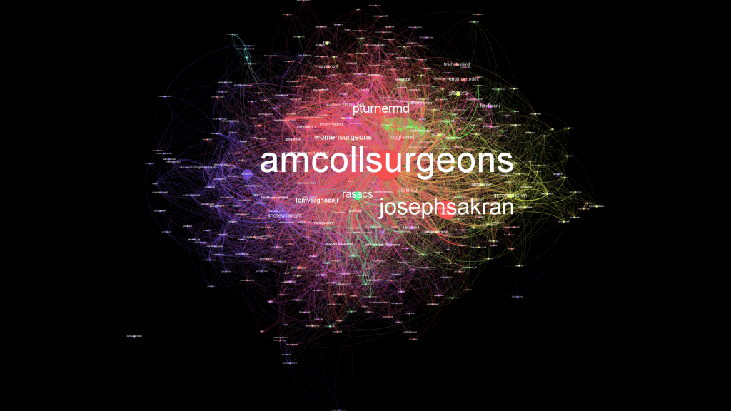
The dots or “nodes” represent Twitter users such as @AmCollSurgeons and @WomenSurgeons. Hovering over a node reveals the username. Connecting lines represent interactions such as a mention, favorite, or retweet. The colors highlight “communities” or “conversations” revealing sub-networks within the overall conference dialogue. Clicking on a node highlights the network of the selected user, allowing you to view the individual user’s impact and participation in the overall network. Being able to visualize the network of an individual user serves as a proxy for their influence within the Twitter community. For example, click on the pink node in the bottom right; you will see the sub-community of @heatherevansmd. Notice the multiple nodes connected only to her. Those are her colleagues back at home, participating in #ACSCC14 through Dr. Evans.
#ACSCC15 – Massive growth of conversations and users
To establish the data set, I imported all the tweets that contained a “mention” (i.e. @name), those that had been favorited or “liked”, and all retweets. The initial visualization of this much larger group of tweets from #ACSCC14 looks like an explosion of connected points. To make it more legible, I then limited the data points to nodes of users with 10 or more mentions/favorites/retweets.
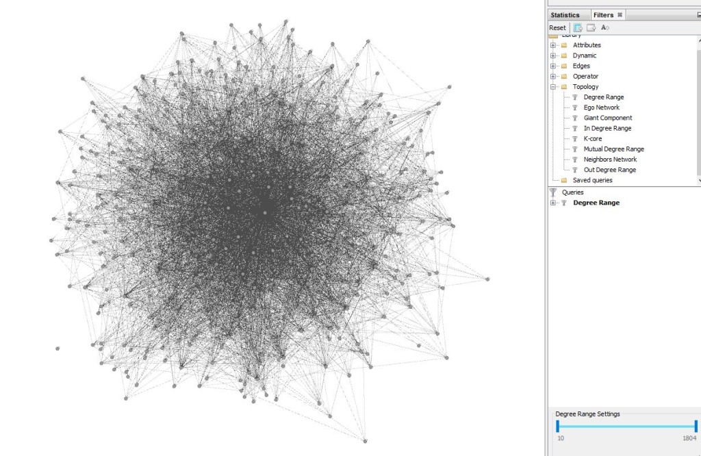 Multiple algorithms were used to determine data points of interest. For example, the “Degree Distribution Average” (i.e., the average number of connections to each node) was a bit over 4 Twitter users per community, but only the top 10 communities are color-coded.
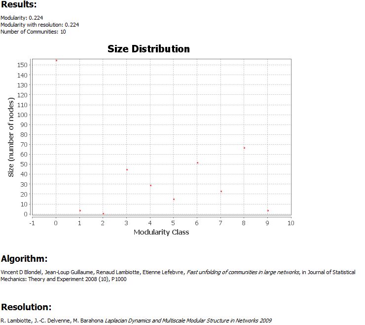
The “communities” were determined by calculating the modularity of the tweets and colorizing those users whose tweets demonstrated intense modularity. Modularity is a measure of the strength of division of a network into modules (also called groups, clusters or communities); in this case the modularity increases with increased strength of interactions as measured by retweets, replies, and favorites.

Once the nodes were colorized based on their communities, the nodes (i.e. users) were weighted based on volume of mentions, retweets, and favorites.
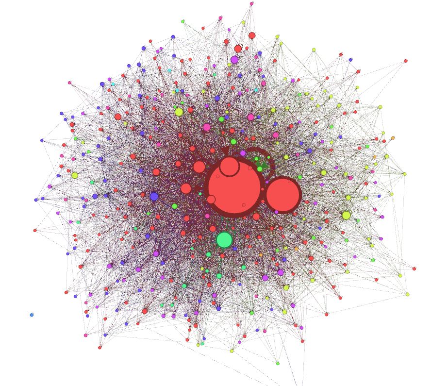
Finally the visualization was manipulated for clarity by expanding the spacing, adding and removing gravity from the weighted objects, adjusting alignment, and labeling.
This non-interactive version is 1080p with a black background. Download it to zoom in to see all those users and connections!
1080p – High-res version of #ACSCC15 Twitter user network.
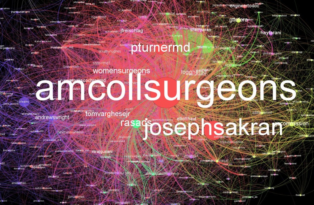
Zoomed in Screenshot
The last step is to take the data and make it more interactive, enabling the user to view the network as a whole as well as to break down each user’s network. (The programming involved in this is beyond the scope of this blog.)
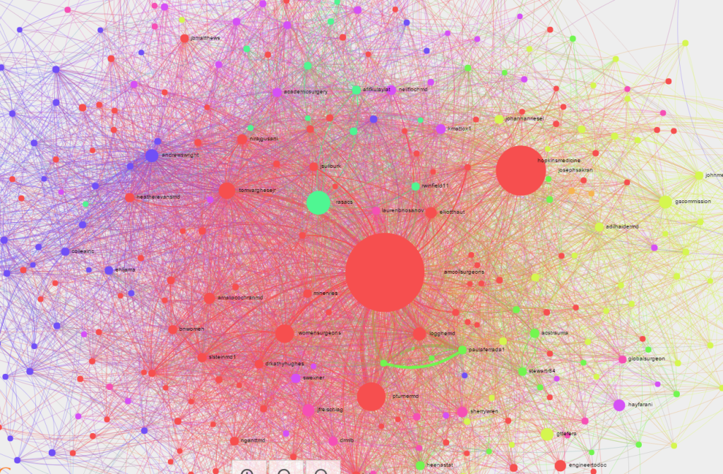
#ACSCC15 – Twitter User Network Data Visualization
Click here for the interactive version of #ACSCC15
What changes do you see between 2014 and 2015? Look at the number of followers many of the users picked up over time. Who were the major Twitter influencers at the conference each year? What surprises came out of the visualizations?
Similar visualizations will be created for the 2016 Academic Surgical Congress. Follow @presentservices for future visualizations of the #ASC2016 Twitter communities. You can discuss and ask questions in our comments section, or you can always tweet me.
I’d also like to thank Heather Logghe and Christian Jones for helping me co-author and explain the data for this project.
– Matt “Mookie” Thayer – @presentservices